7-step guide to creating a bespoke website design that generates leads

What’s the point in having a beautiful bespoke website design that is not optimised correctly? You’re losing all your potential leads that your website has worked so hard to attract.
Follow these simple tips to optimise your bespoke website design to its max:
1) Unleash your Speedy Gonzalez/inner Usain Bolt
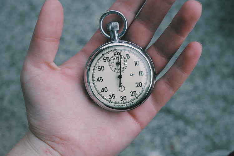
Page speed and page size play an important part in aiding the conversion of your bespoke website design. If a page speed is too slow then visitors will be quick to abandon your website according to a study conducted by Akamai. This could be disastrous if your website specialises in e-commerce. This will not only lose you sales but also conversions and potential re-conversions too. Customer’s who have abandoned your site previously are not likely to return due to their poor online experience with your brand.Page speed needs to be within 3 seconds as demonstrated by most world-class websites. If they load any slower than this then visitors will abandon your website and look elsewhere. You can try and cut down your page speed by scaling and compressing all images used on your site appropriately.

Page size (or page weight) also definitely plays an important factor in page speed and optimising your beautiful website design to its full potential. Website designs that are too large or ‘heavy’ will have a bigger page size, therefore, taking longer to load resulting in a poor page speed and visitors abandoning your site. Page size doesn’t just have an effect on visitors, though; it also has an important part to play in SEO rankings.
Google uses page size and speed as a determiner for website domain authority and page rankings as generally speaking; faster websites make much happier users. So, technically the quicker a website loads the higher it will rank within search engine results. As a rule, your website pages should generally be 3MB or smaller for optimal performance.
2) Take advantage of your mobile mojo
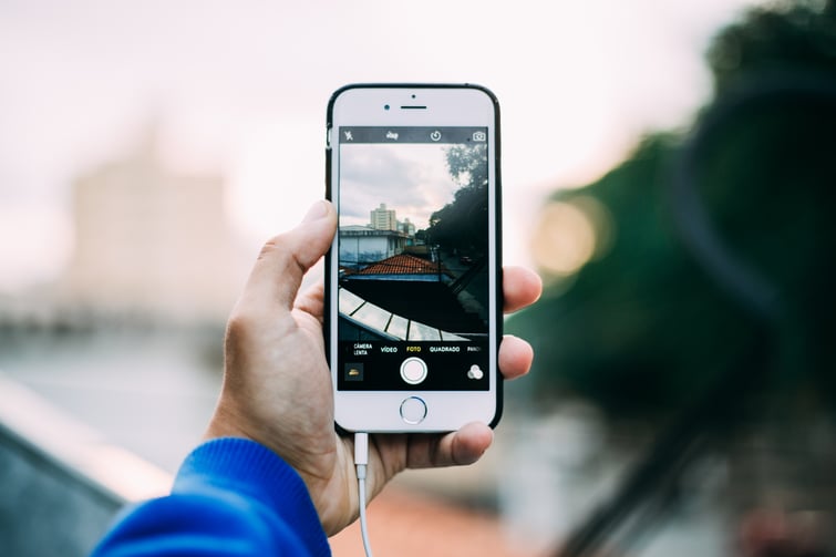
We’ve all been there, you’ve clicked on an article you’ve been really keen to read after seeing it shared on social and it hasn’t loaded correctly – if at all. You can barely read the text, the images are all over the place and it seems as if it’s never going to sort itself out. Would you really want to stick around? No of course not and that’s why you need to unleash your mobile mojo upon your web design.
With more people viewing content via mobile devices than ever before it’s beyond crucial to ensure your website design is mobile friendly or you’ll miss out on these valuable conversions. Basically, you want your visitors to be able to do what they visited your website to do in the quickest and easiest way possible. This could be to read a blog, place an order or download some awesome content of yours.
Follow these best practices when making your website design mobile friendly & increase conversion rates:
- The bigger the better – this applies to both images and text! Making images and text larger will make it easier for your user to read
- Keep calls to action clear – Make these as simple as possible, preferably use a button image so the user can view it better and therefore will be more inclined to click your CTA
- Ditch the complex mobile web designs – A clean and professional finish to your website design will be much more mobile and user-friendly

3) Content is King
So your bespoke website design is the right size, the right speed and right on point for mobile viewing…but what‘s next? Optimising your content for conversion that’s what. You all know the expression – content is king but in regards to conversion rates it really is!
Creating content that fits with what your business is all about is just the beginning of optimising your website design. You also need to ensure that your website content fits with both your content marketing and your SEO strategy. Here are our top tips for creating conversion orientated content:
- Get to the point: Make sure the reader understands the point of the article in the first few sentences
- Keep the user engaged: Create engaging and downloadable content to keep your audience wanting more. By doing this you are able to capture reader's information via a form - a contact us button in the top right is not enough anymore
- Utilise keywords: When writing your content, keep your keyword strategy in the forefront of your mind. All your content should fit with your SEO strategy
- Make the headlines: Using action- orientated headlines will direct the user into doing exactly what you want them to do - convert!
- Focus your content on your target market. This will ensure you are targeting the right people for your unique content. Creating content based on your target market will also hopefully mean that your audience finds your content interesting.
4) Calls to actions
How can you expect to increase conversion rates with your visitors if there isn’t any place for them to actually convert? You can’t. You can have the most intricate and beautiful website design imaginable but without anyplace for visitors to convert the entire website is useless. Creating clear and direct calls to action will help push visitors through the buyer’s journey and aid in the conversion process. Calls to action should be:
- Eye pleasing – They should comprise of eye-catching colours and images to encourage visitors to click through to the offer
- Encouraging action – Copy on the CTA should include words such as ‘download’ or ‘get’
- Clear – CTA’s should have a short amount of copy to demonstrate exactly what the user will get if they click on that offer
- Remember, not everyone is ready to ‘buy now’ so think about calls to actions that help you gain initial interest, that you can nurture over time and build your audience, rather than losing the visitor never to return.
- Make sure you have CTAs at the end of every blog post, page or news article. Make sure they are interesting and not just a phone number or a ‘buy now’ style. Mix them up and test different things. Keep it interesting.

5) Images
Whilst it may not be completely necessary to include images on your website it sure makes the experience a lot more enjoyable for the user. This is probably down to the fact that the human brain processes visuals 60,000x faster than text!
This means that the message of your website is more likely to be absorbed and retained by the user if it includes images. This is especially important in a world where the average person is exposed to 4,999 – 10,000 advertisements a day!
Besides communication benefits and enhancing the user journey of your website images have multiple uses within bespoke website design. Such as:
- Aiding in readability
- Capture the reader’s attention
- Creating focal points
- Visual appearace
- Represent your business/tone of your business
So go ahead and get creative with your website design’s imagery! Just don’t forget to add relevant alt text to the image (more on this later!).
6) Let’s get social
What do you call a powerhouse platform with 2.3 billion active users across the globe? Social media. Yes, you read that right, 2.3 billion active users and counting! Businesses today simply can’t ignore the influence this avenue has upon conversion rates and website design.
With so many people out there capable of sharing your content at a touch of a button you need to ensure their user experience is a positive one. This includes making sure your website design provides them with social sharing options as often as possible! Integrating your social media in this way has many benefits including:
- Increases website traffic – more social shares = more visits
- Improves social media following/social media presence as more people are inclined to follow you
- Raises awareness of the content you’re producing
- Demonstrates how socially savvy you are
You should definitely include social sharing widgets and icons on every page of your website – this mean blog posts too to gain the best conversion rates. We recommended these being placed at the top, bottom or along the side of your website page for optimal results.

7) SEO
So now you’ve optimised your website design to the max it would be a complete waste to have no one discover, use your site and convert from a website visitor into a lead. This is where search engine optimisation (SEO) comes into play.
Optimising your website design to the best of it’s SEO capabilities will not only aid in conversion but it will increase traffic. So much so that studies suggest that 64% of website traffic comes from organic search! Therefore it is absolutely essential that your website design is optimised to it’s maximum potential to ensure complete visibility to potential website visitors and customers.
Although it does take time to improve your SEO rankings amongst the big search engines it is one of the best ways to improve conversion rates as it helps ensure the right people are visiting your website. Of course, there is much more to SEO than what we’ve outlined within this section due to the complexity of the subject. However, following these simple steps will improve your website design’s visibility to search engines and increase conversions in no time:
- Conduct keyword research to determine the exact words and phrases that are most relevant to your business. You should aim to do this at the beginning of your SEO optimisation to avoid wasting time trying to rank for the wrong keyword
- Utilise clear page headers (that include the keyword you’re trying to rank for) as this will not only instruct search engines what the website page is about but your visitors too!
- Optimise your website URL’s to include the keyword you’re trying to rank for but don’t go too crazy on this
- Ensure all images utilised in your website design have alt text which includes the keyword you’re trying to rank for as this describes what the image is about to search engines
- Don’t forget meta descriptions! These bad boys help search engines (and the reader!) to understand what your website page is all about. These too should include the keyword you are trying to target as search engines use these descriptions to return results to the searcher. Meta descriptions can add to improving your conversion rate as they increase your click-through rate to your website. This is because the more accurate and relevant your meta description is to a user’s search the more it will be clicked. Think of meta descriptions as mini sales pitches for your business – they need to be appealing to the user to enable better click through rates.
So there you have it folks! Our 7 top tips for optimising your website design to enhance conversions. Now you're new fully optimised web design is ready to go you'll need to attract some prospects. Why not check out our 5-step plan to generating leads from content marketing...

Ready to Unlock AI SEO for Your Business?
AI SEO isn’t coming — it’s already here. Capture high-intent traffic and build sustainable pipeline growth.
Get Your Free Audit

